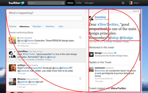
Twitter's "Golden Ratio"
What do Twitter's new homepage design and the lowly nautilus have in common? They are both examples of the Golden Ratio. This is really cool. If you click the link from the Alltop page to Answers.com, you can read an explanation of what the Golden Ratio is and why it is considered an aesthetic ideal in art, architecture and even nature (like a nautilus).